a pillar of architecture
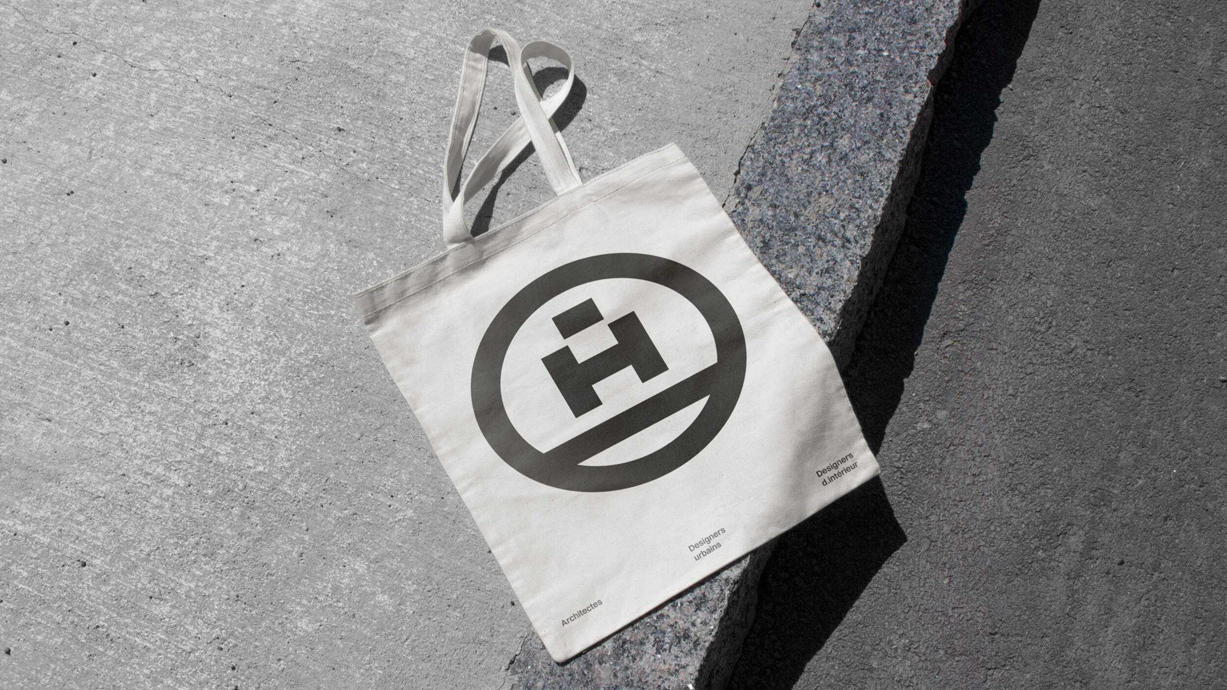
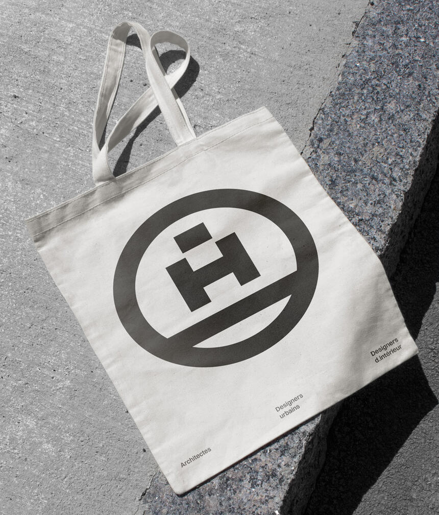
ADHOC
to be inhabited by
2024
Over ten years, ADHOC has established itself as a leading player in the field of Quebec architecture. Today, the firm continues to consolidate its reputation by refining its identity.
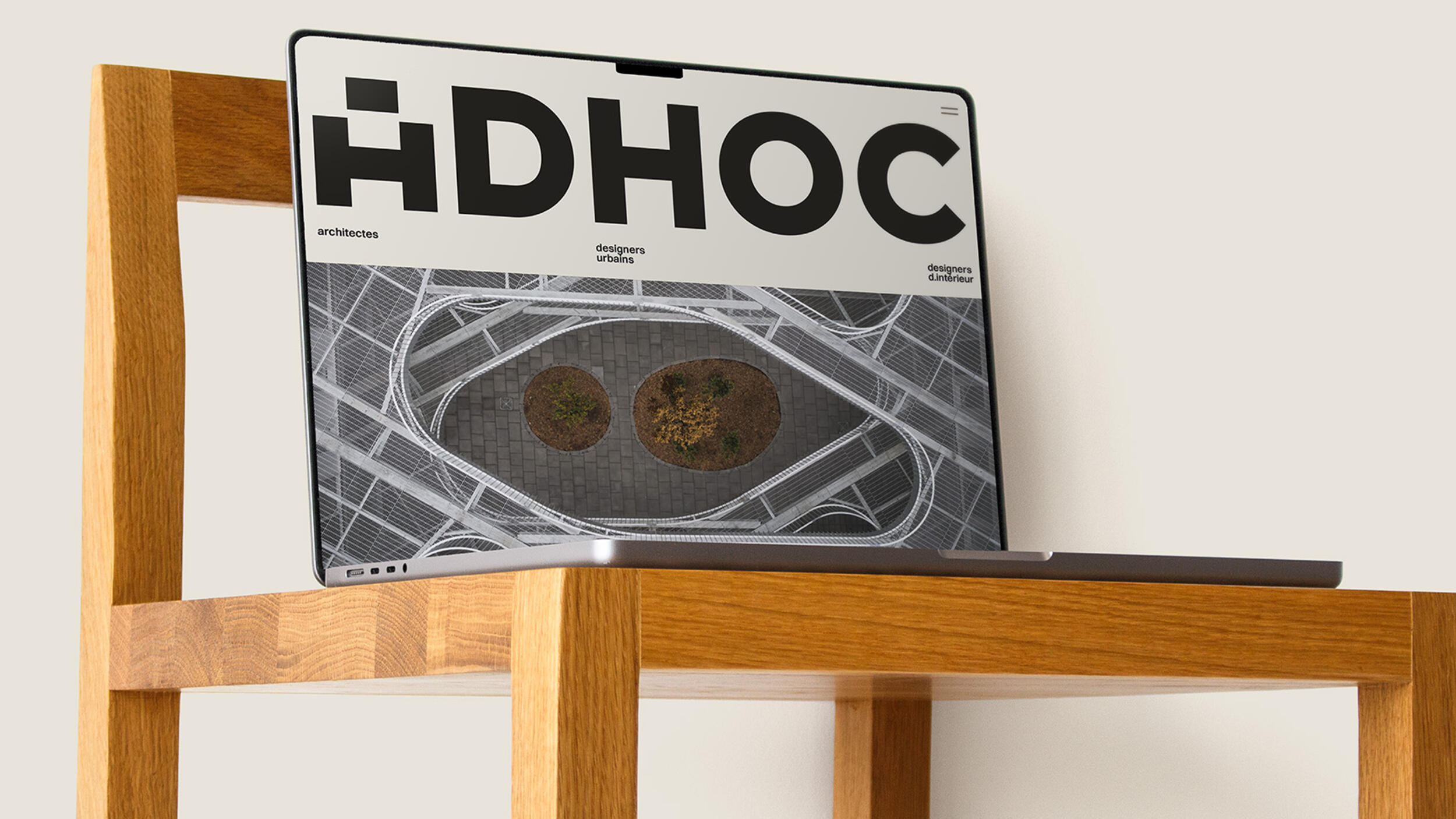
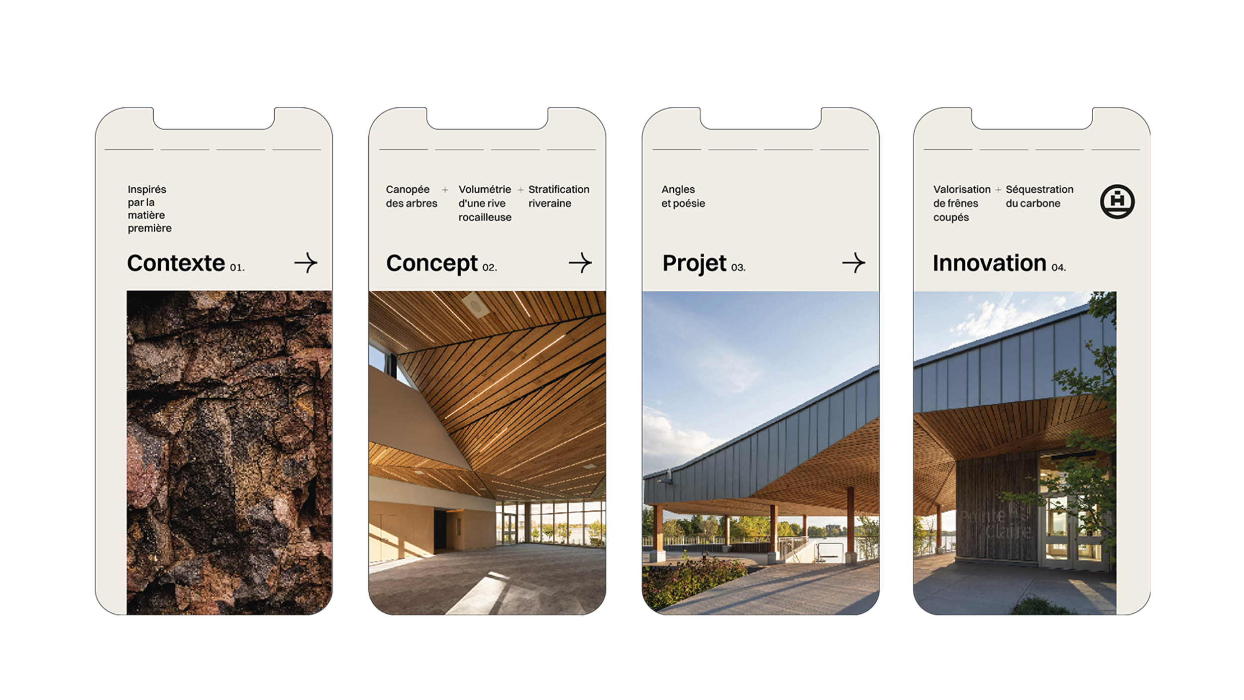
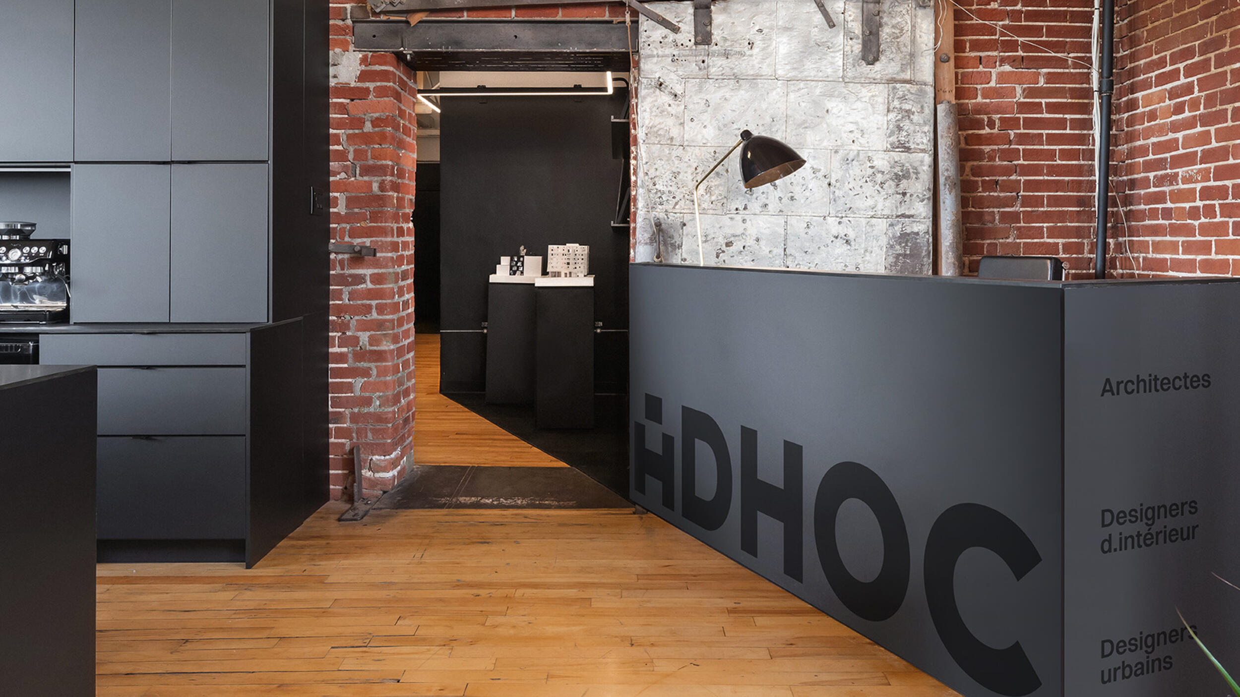
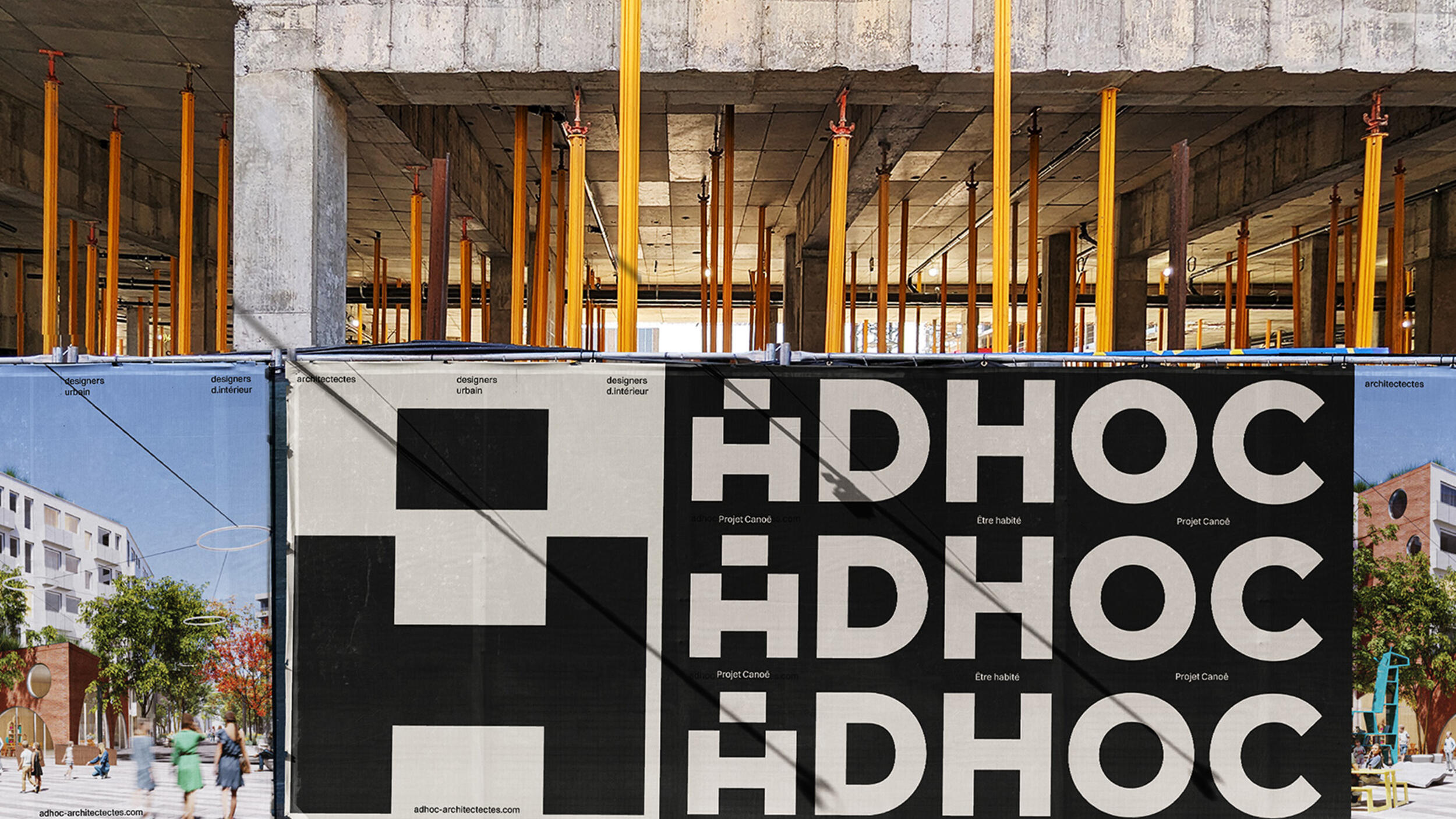
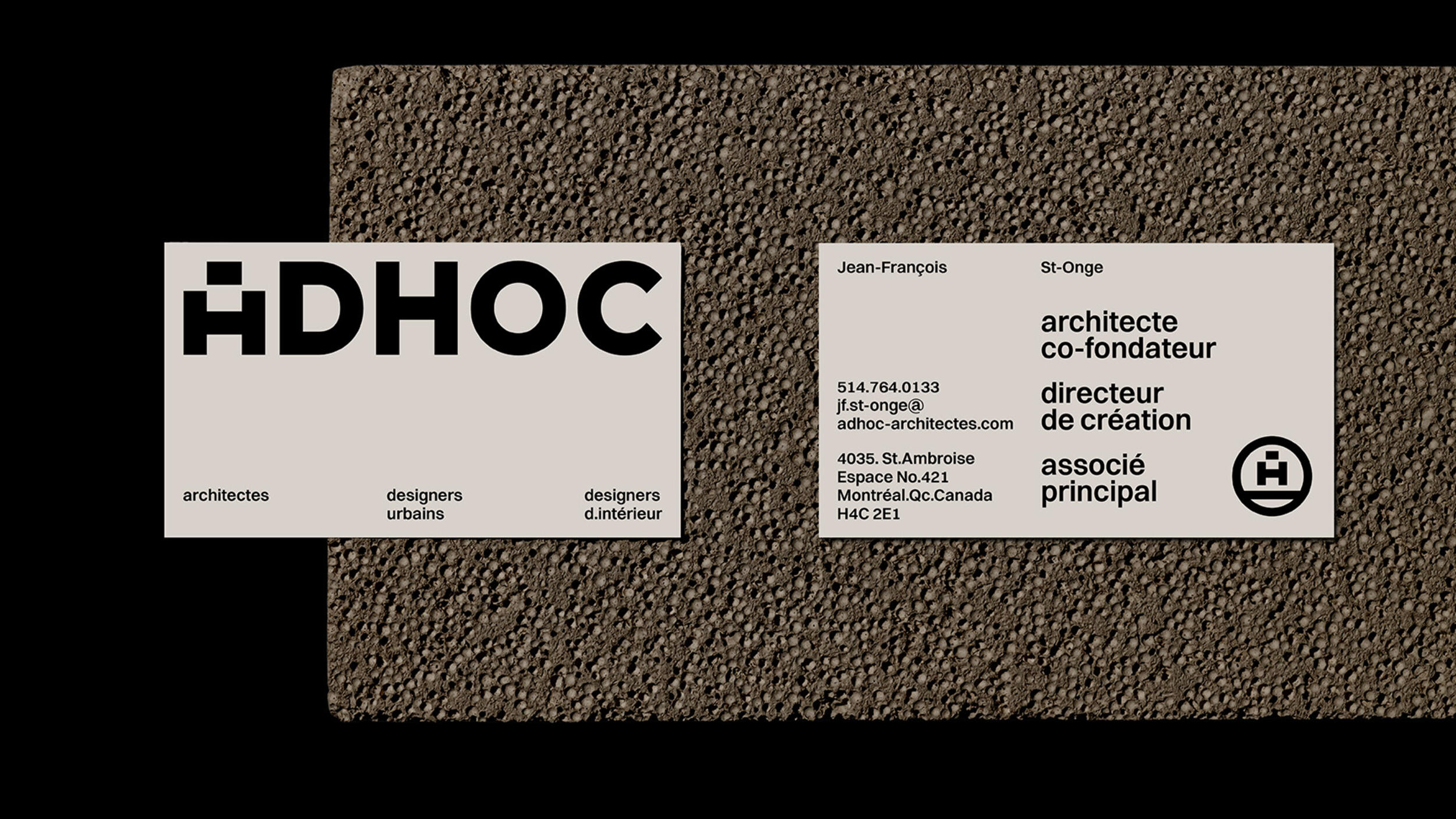
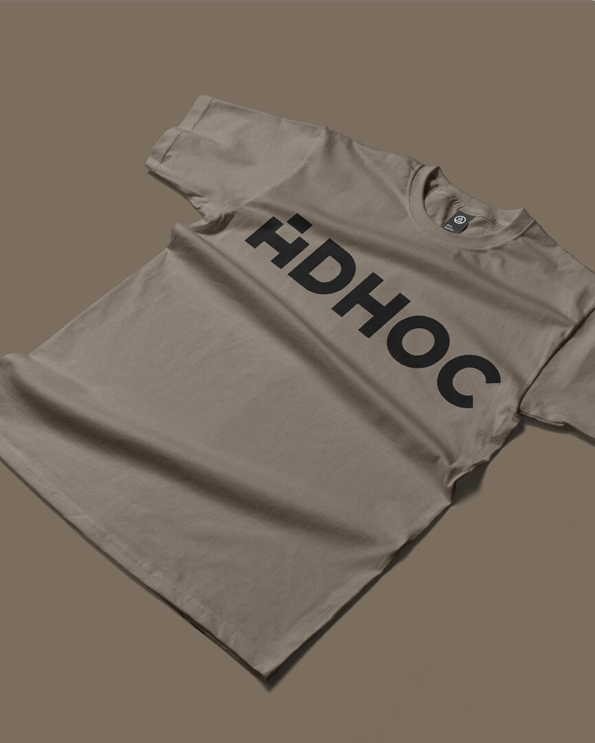
Inspired by materiality, the colours were first simplified, as were the typefaces, standardised to sharpen impact and legibility. The result: an identity that commands attention through restraint and confidence, and a firm that stands out not only for its credibility but for its multidisciplinary scope, leaning on an enumeration of its core services rather than a fixed descriptor.
the human at the centre
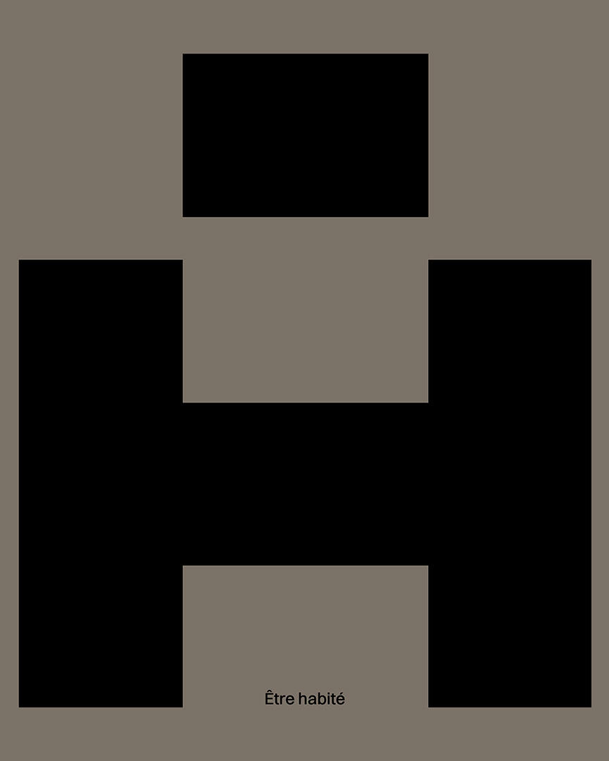
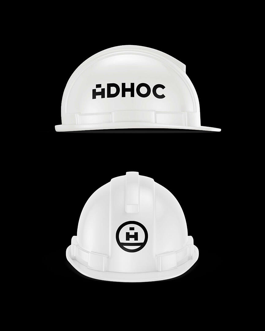
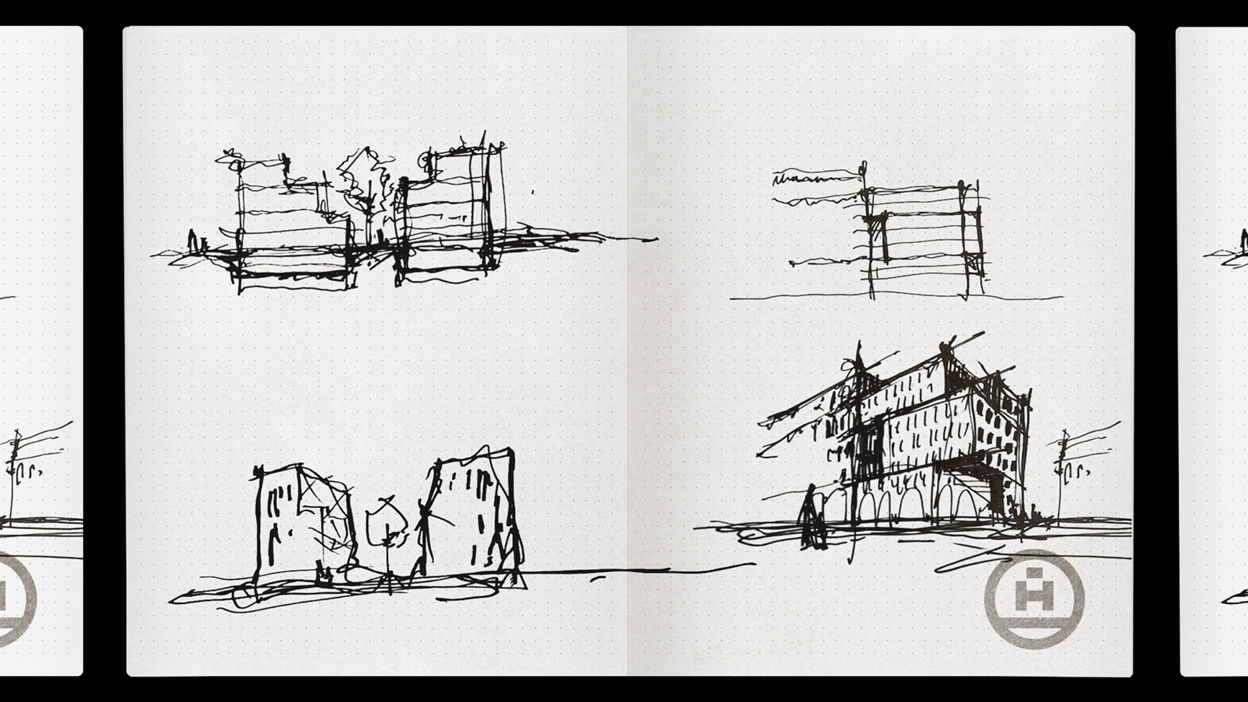
Echoing the H at the very heart of the name, the A is transformed into a small figure, comfortably settled within the landscape. This work on the letterform, combined with tightened letter-spacing, creates greater impact and allows the signature to function as a logo — while the personification of the A, which becomes an identity marker in its own right and can stand alone, transforms the seal into a symbol.

to be inhabited.
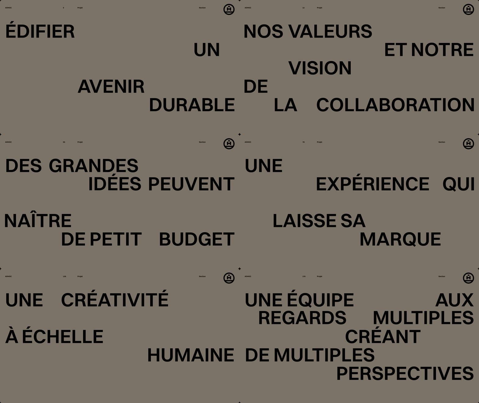
To bring the positioning to life, a simple yet rich signature: the human as unit of measure, the study of habitat as guiding principle. Spare in form, expansive in meaning.