cuisine rooted in tradition
La terre du 9
cuisine rooted in tradition
2022
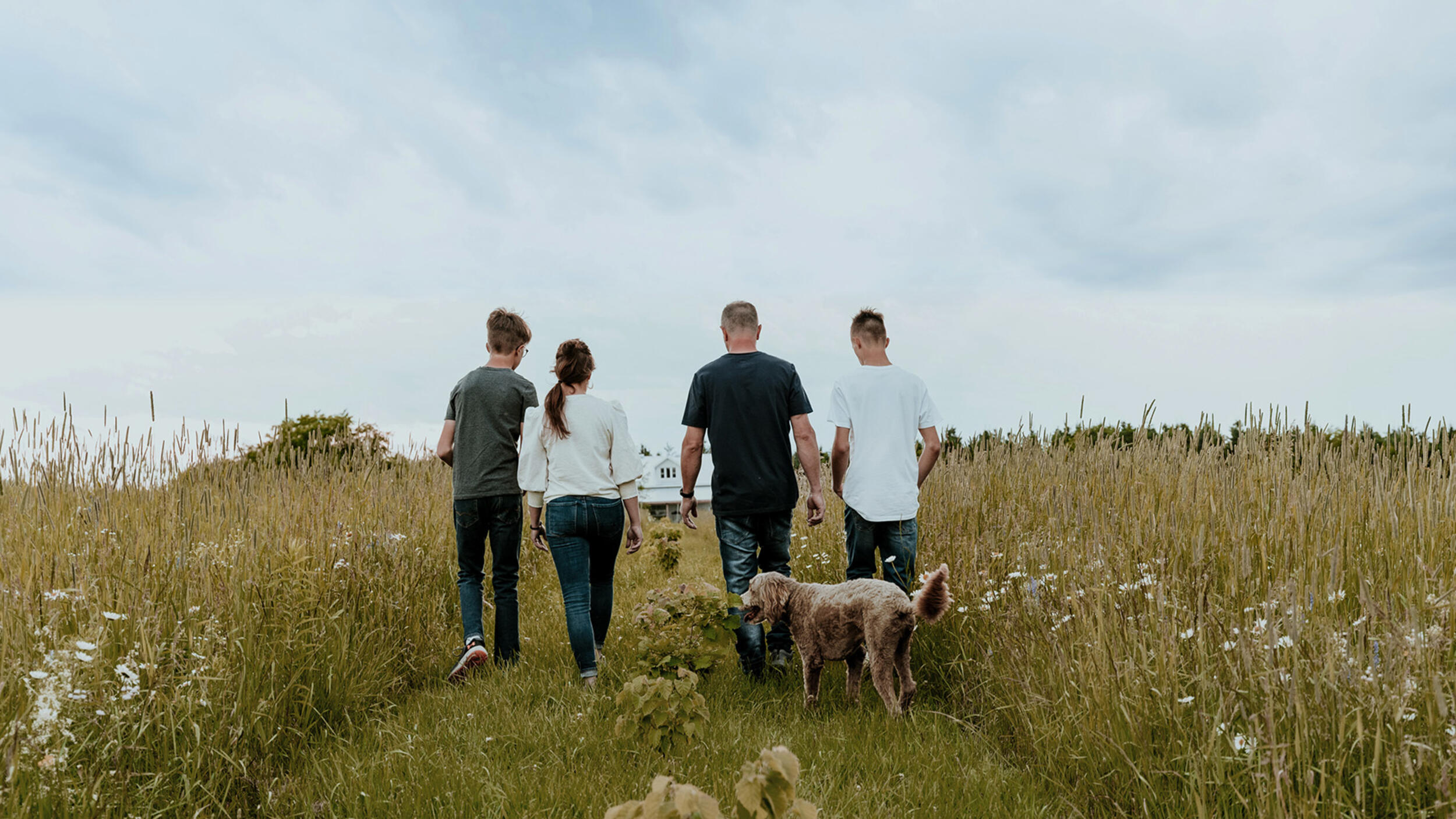
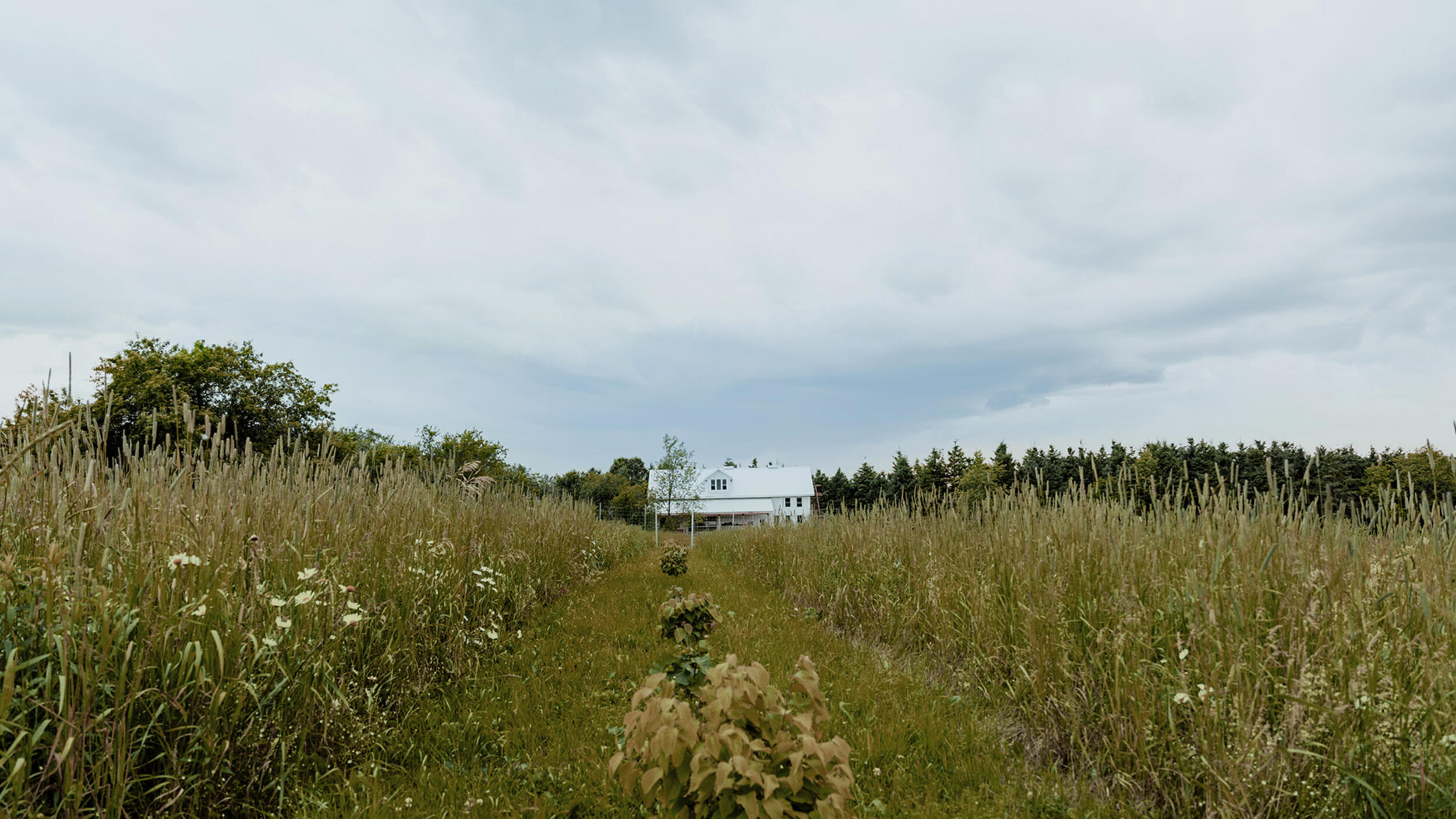
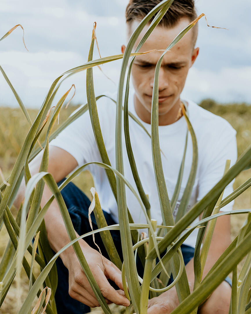
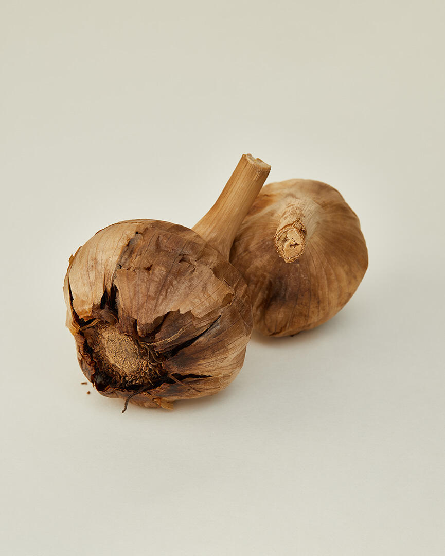
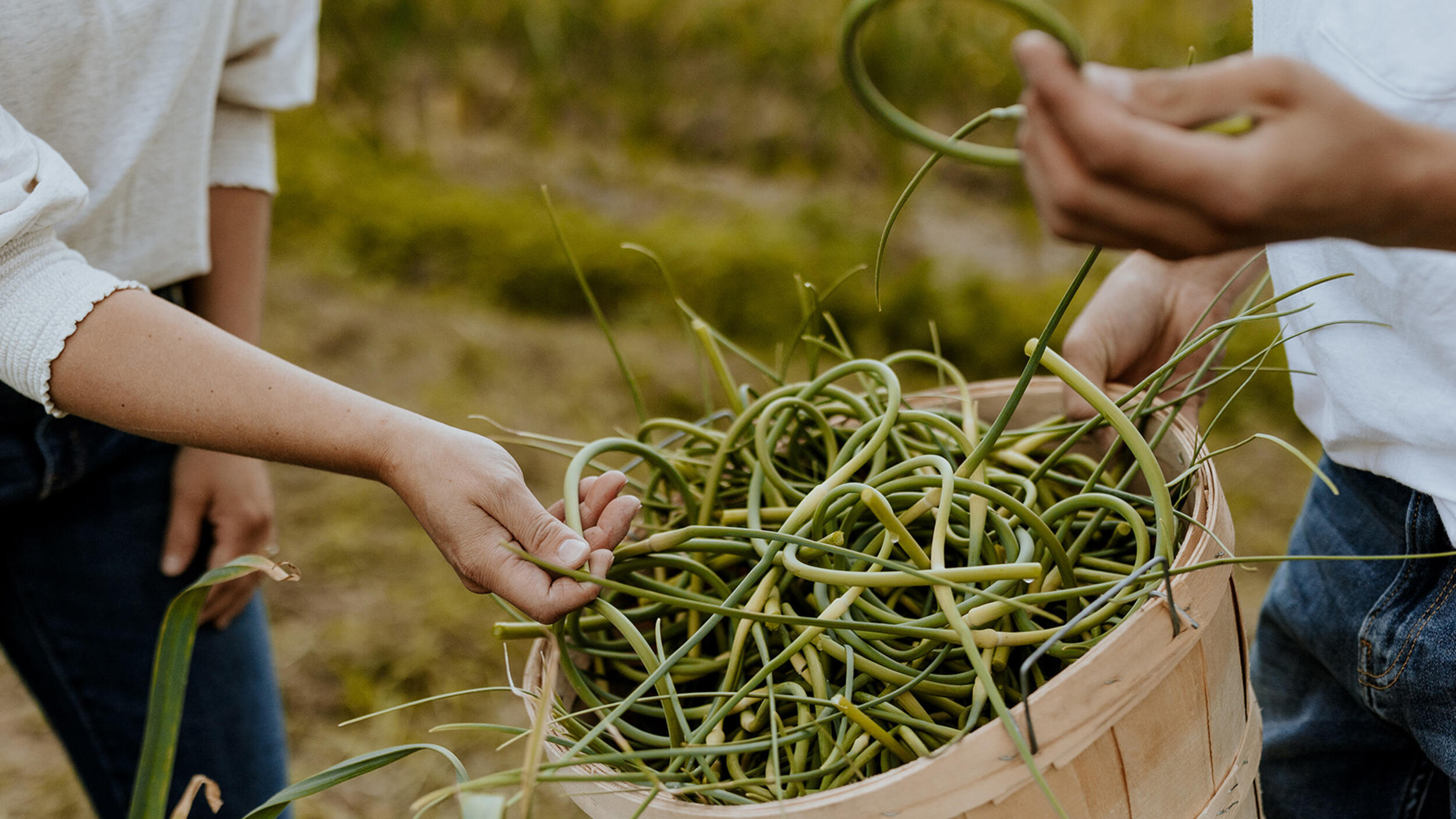
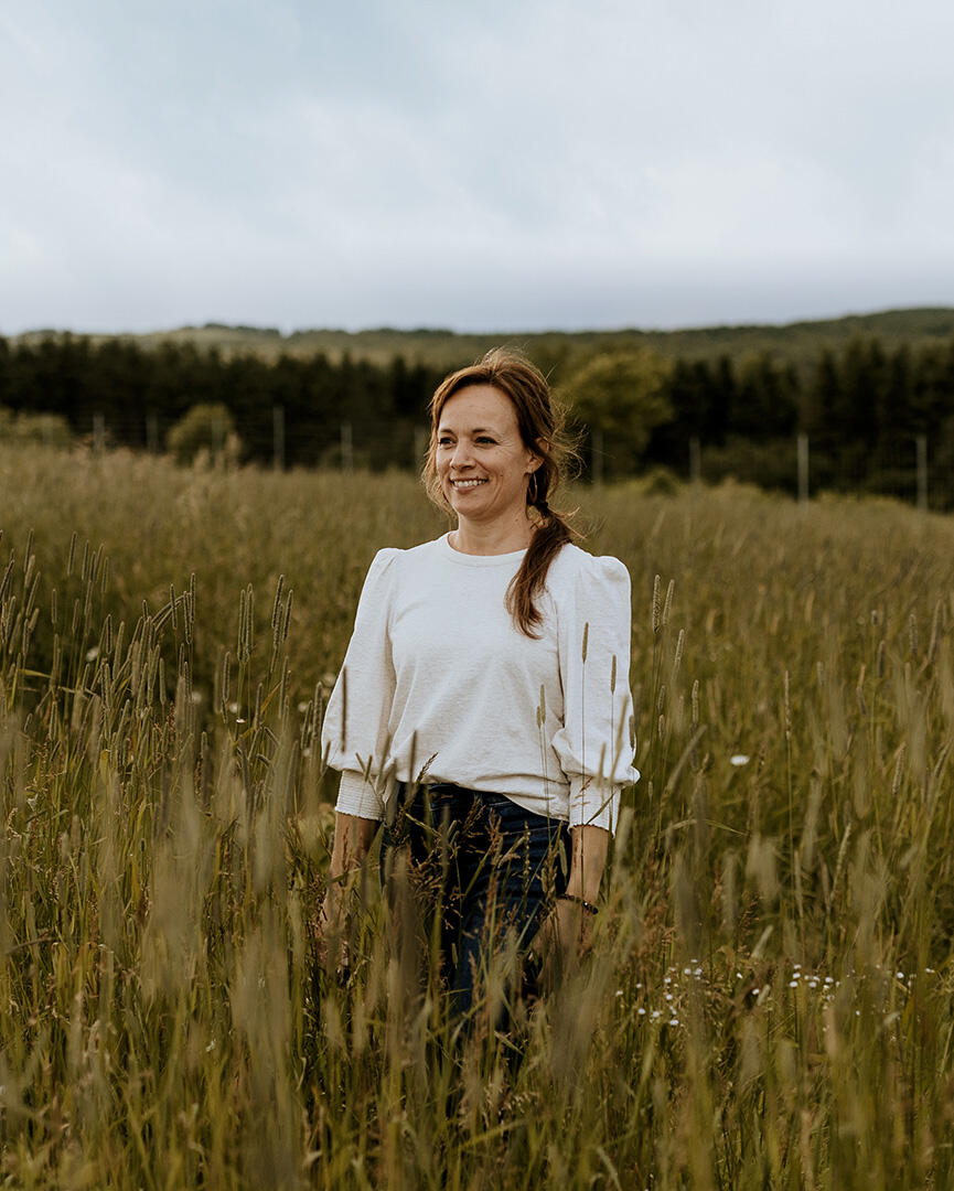
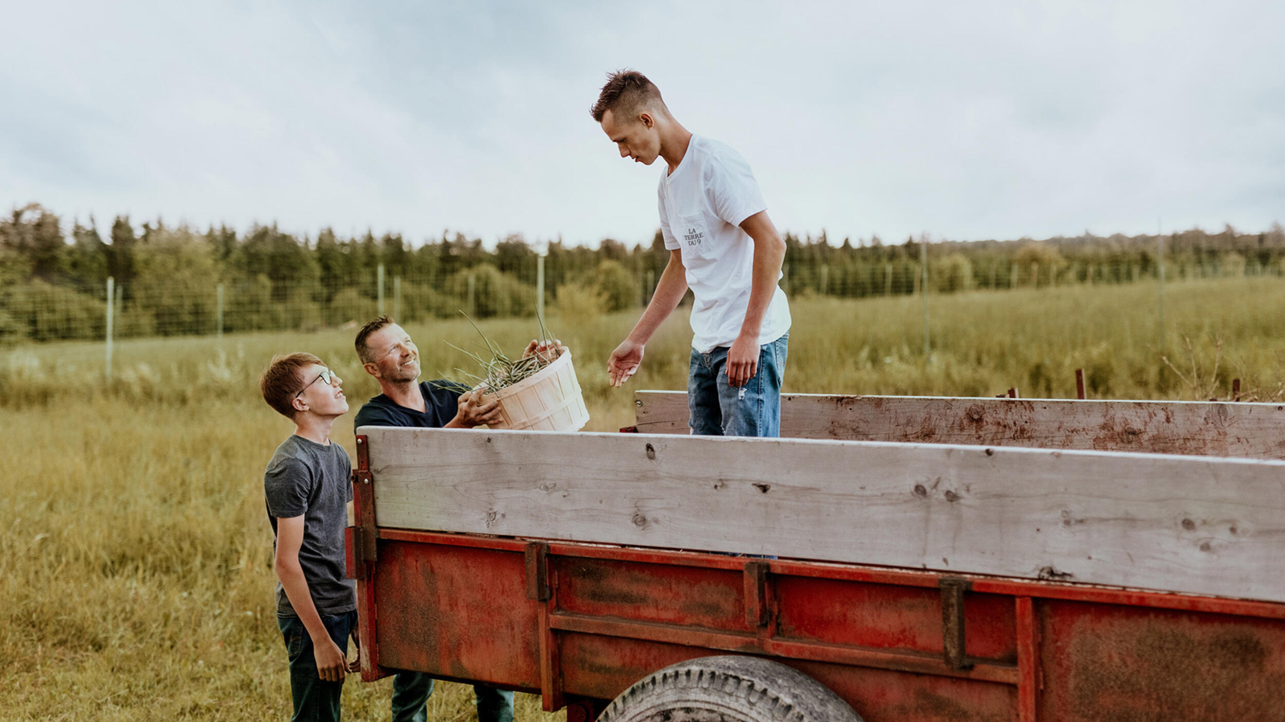
On their land on rang 9, in Beauce, the Binette-Lessard family patiently harvests the finest that nature has to offer. Products cultivated with care and picked by hand; raw and surprising flavours for a rooted cuisine, reinvented.
the essentials
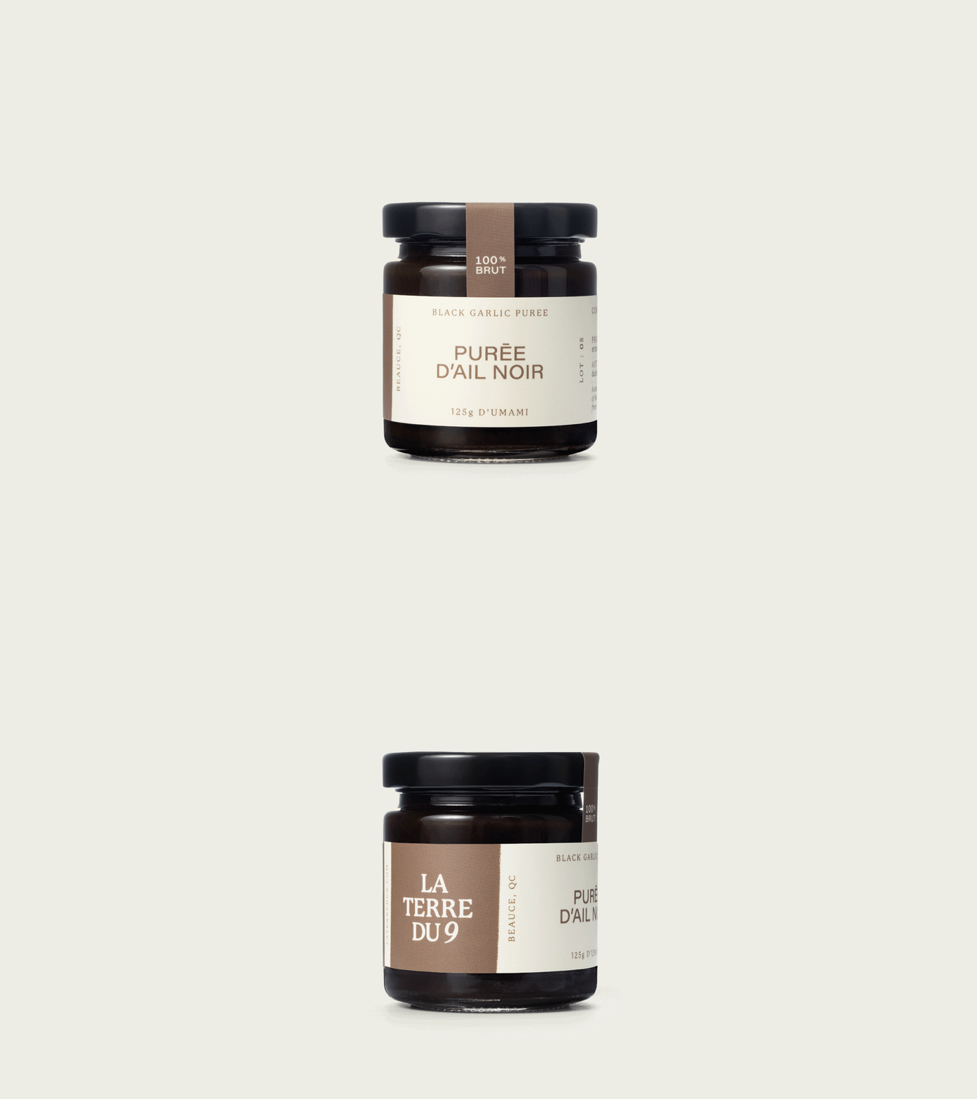
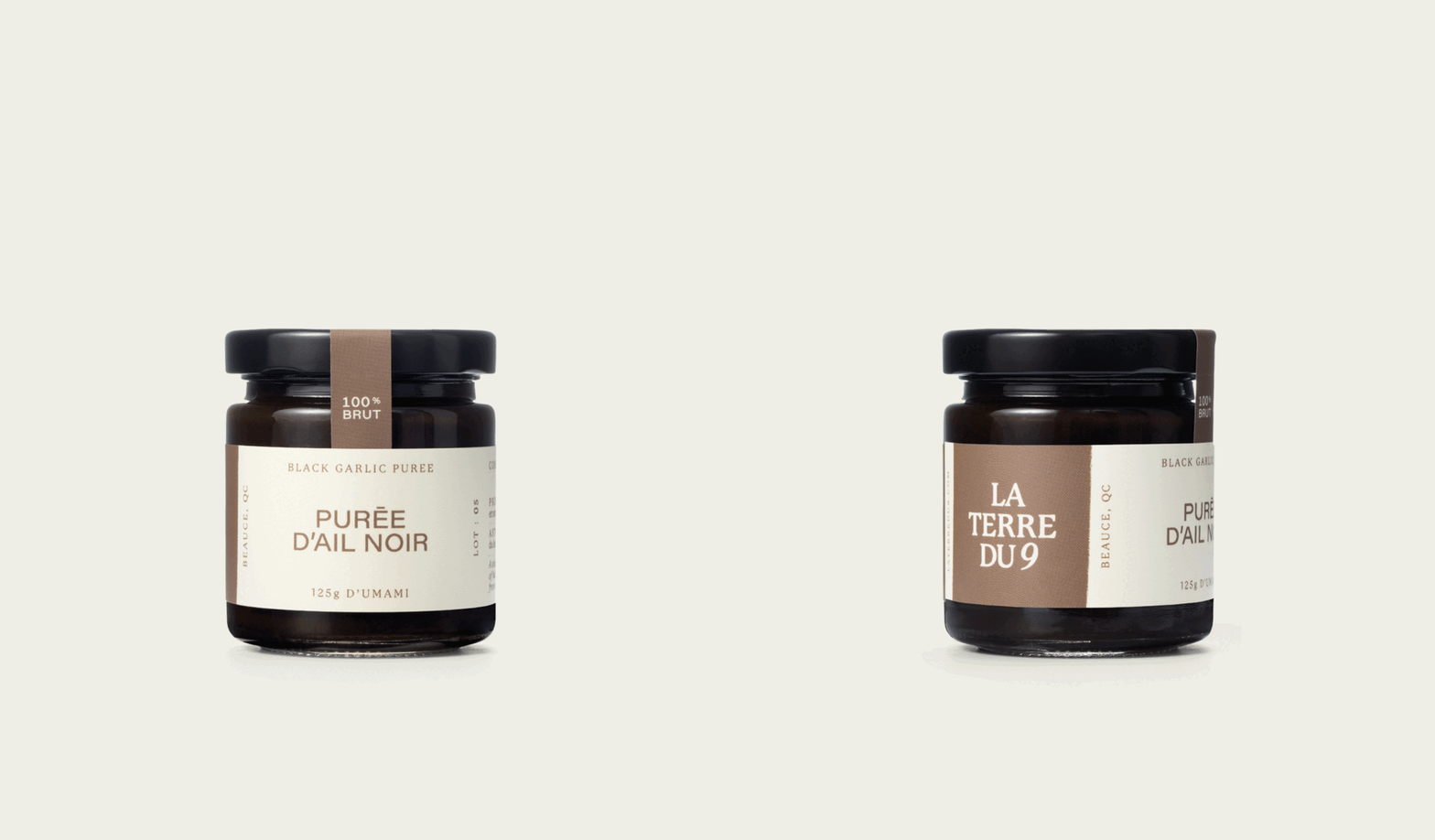
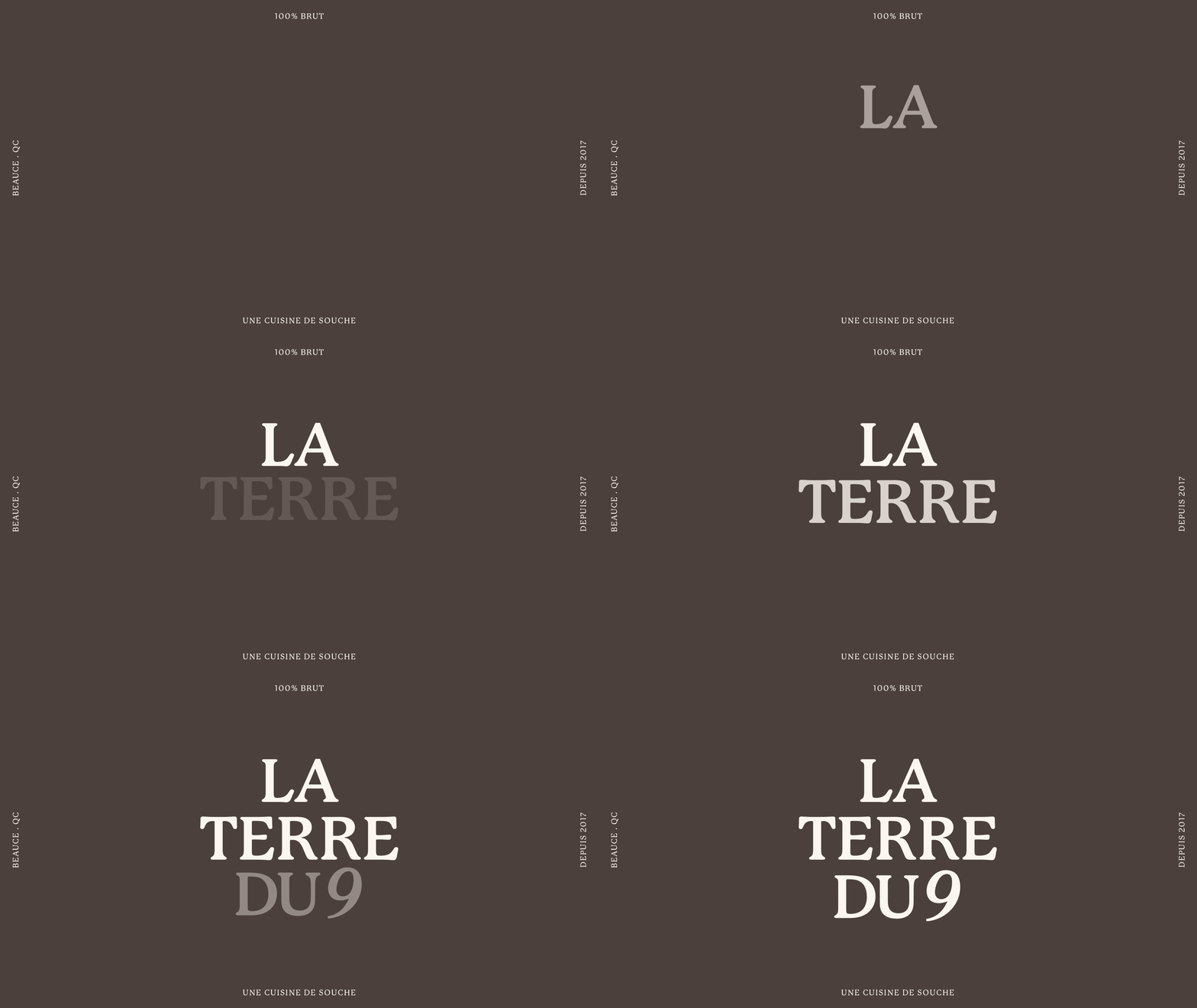
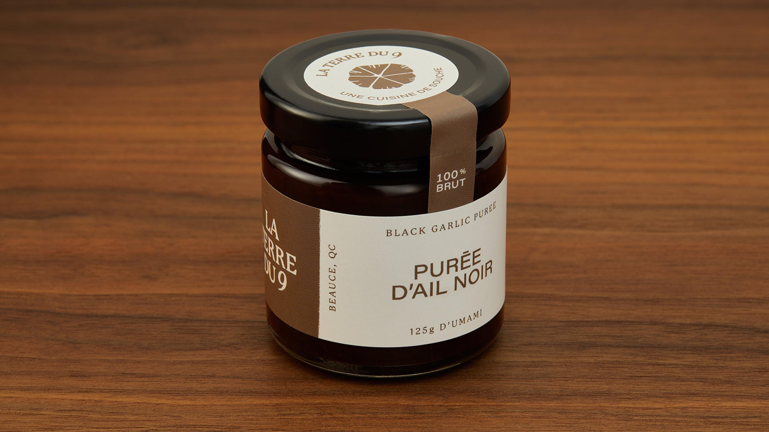
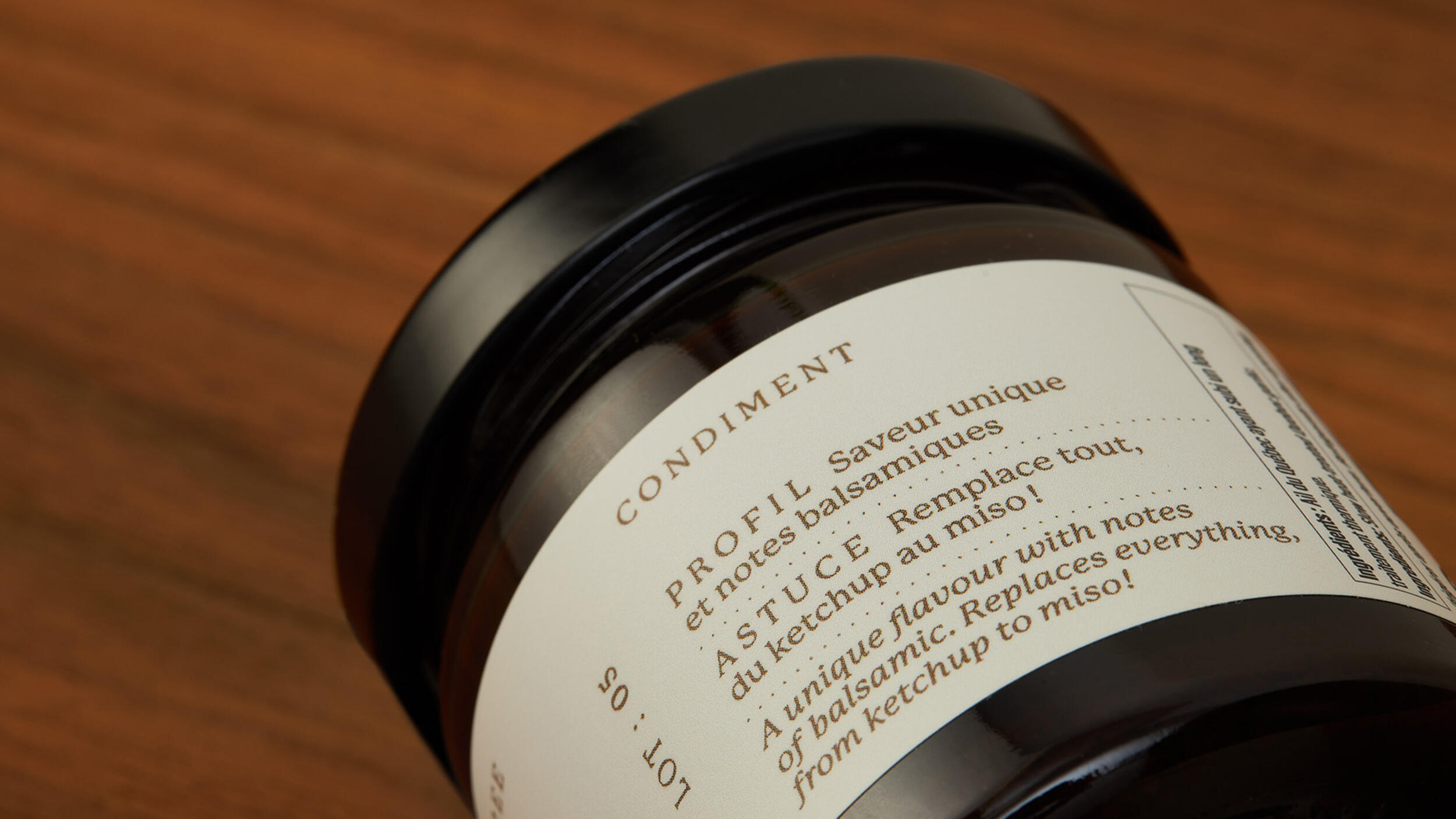
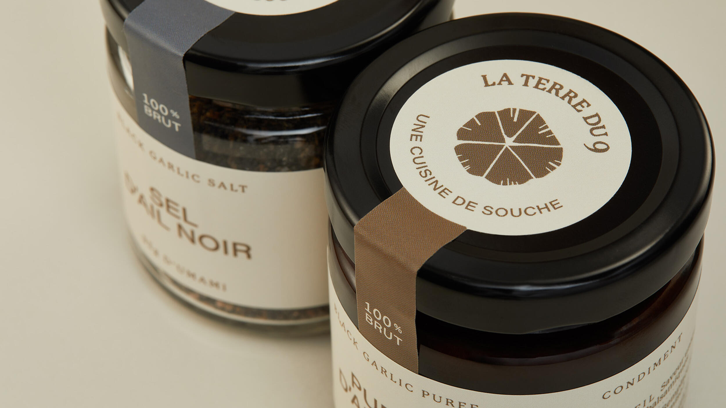
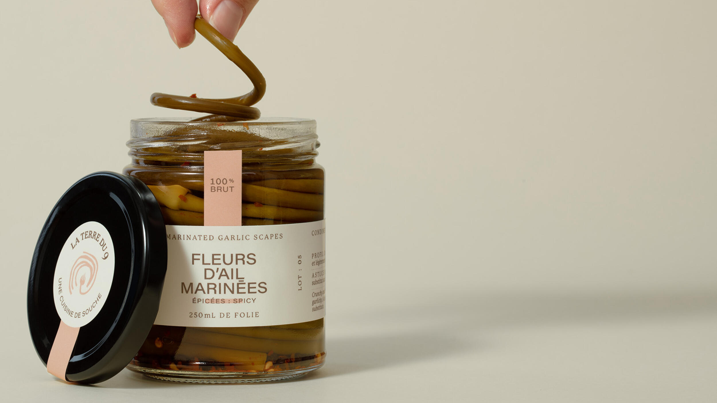
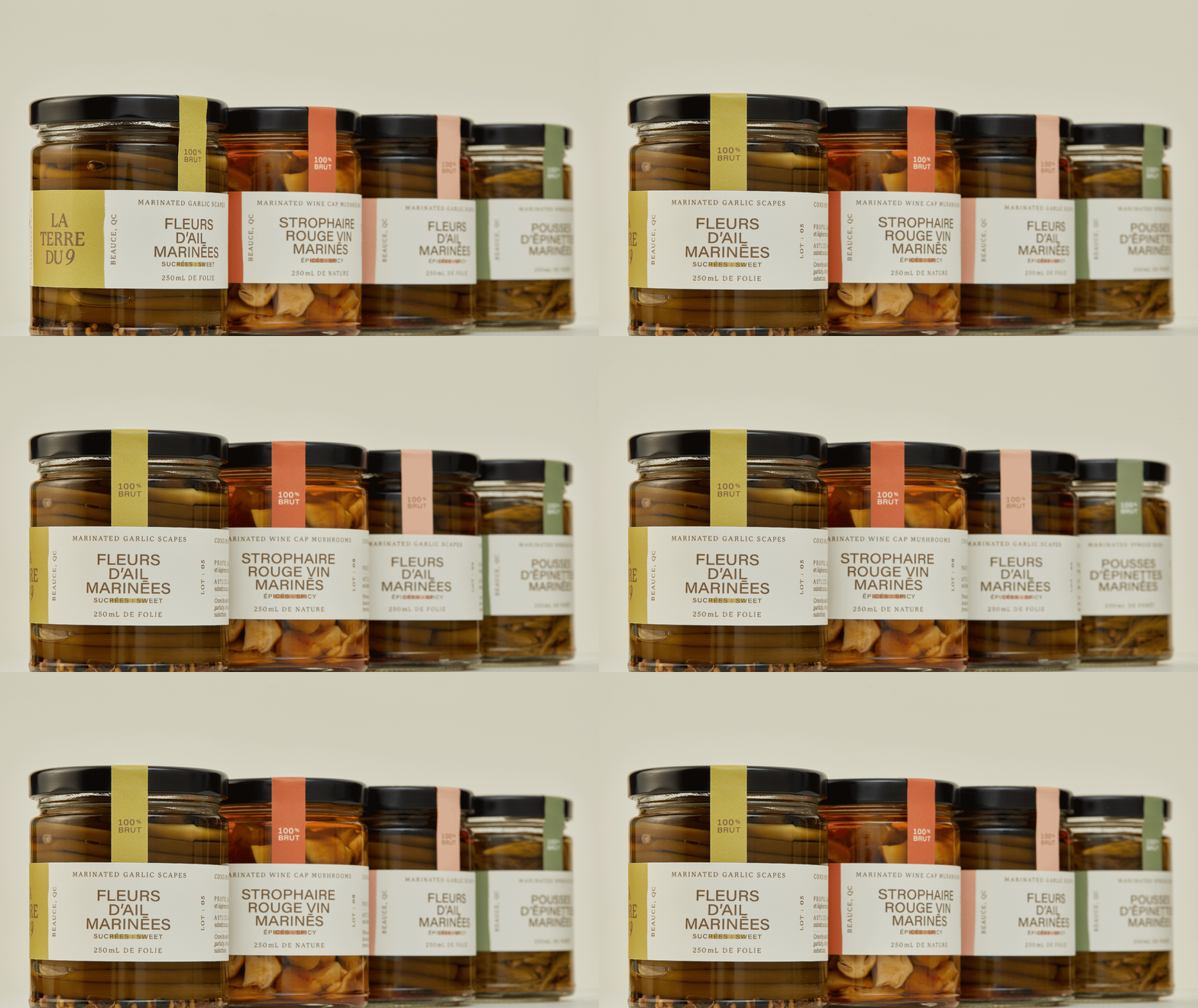
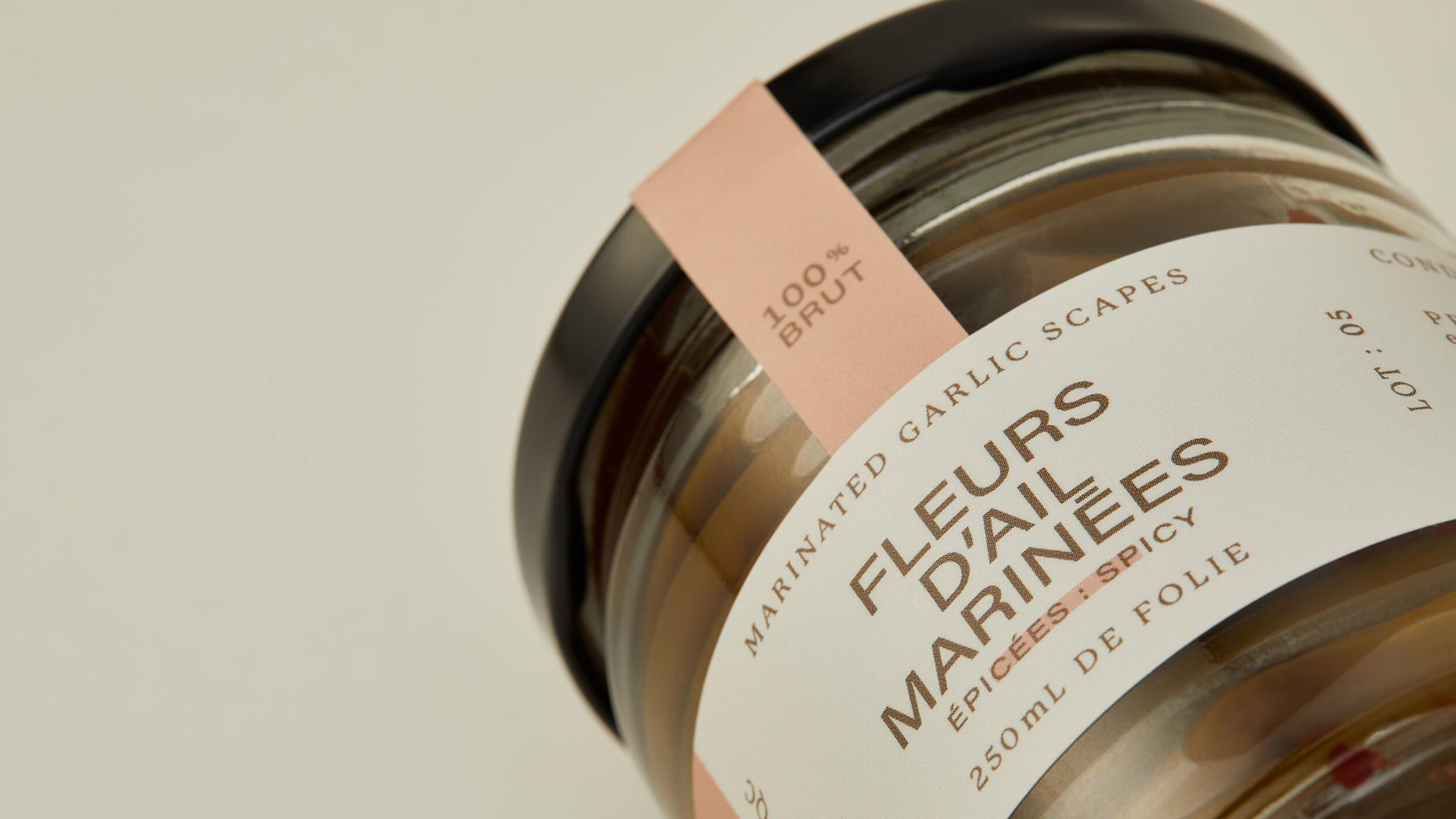
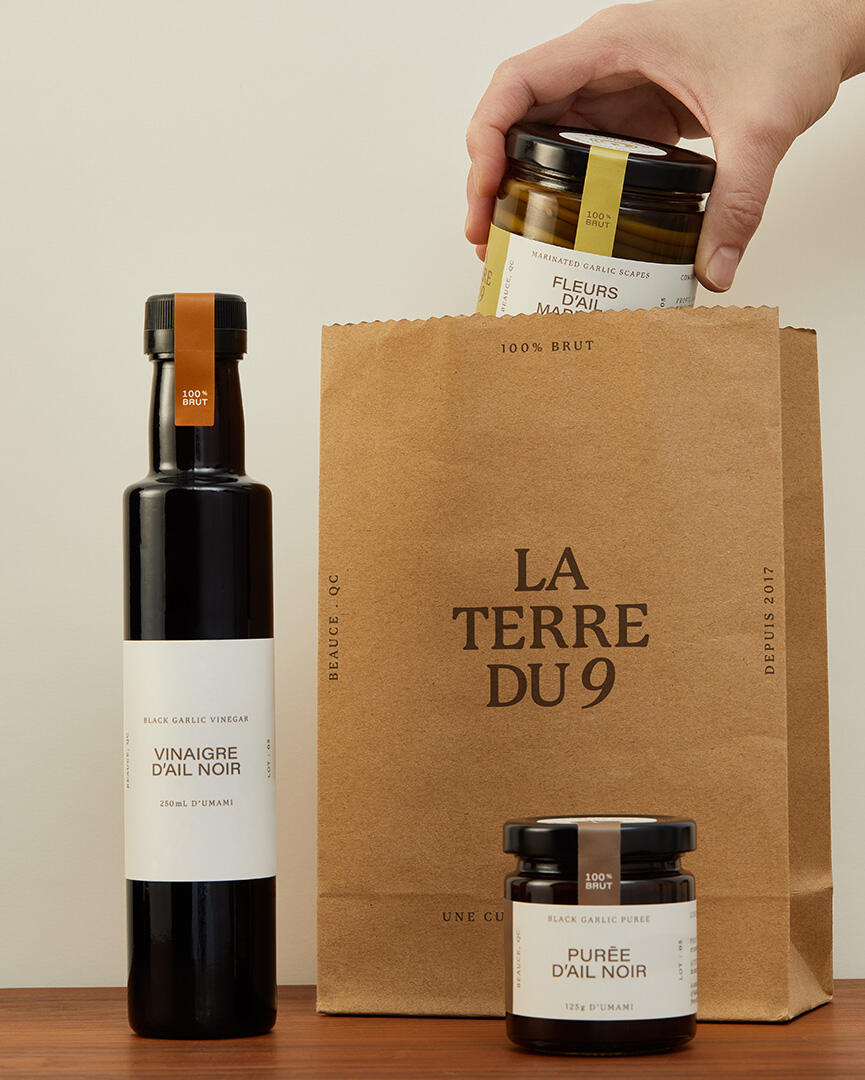
After a few years on the land, condiments and seasonings have multiplied, and some reorganisation is in order. Starting with the choice of packaging and the product architecture, revisited to highlight the family resemblance across the many products. Without losing its character, the logotype is brought up to date. To make navigation easier, the labels are rethought in terms of legibility: like the products themselves, direct and to the point. On all fronts, things are stripped back and structured, resulting in a coherent and elegant offering.
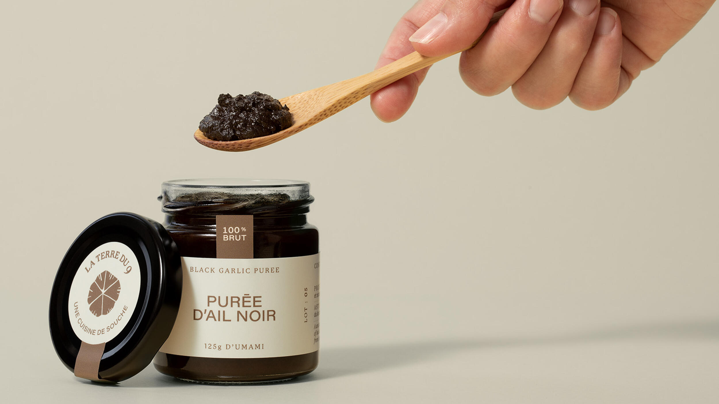
100% raw
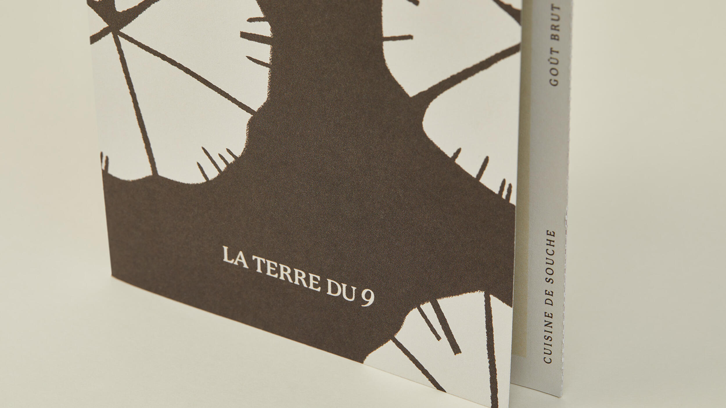
Illustration is chosen for the artisanal quality it evokes, as well as its freshness, a nod to nature. The developed palette establishes the idea of an inventive and colourful rooted cuisine, drawing inspiration from a revalued terroir. The result: attractive and approachable products you'll be happy to leave out on the counter, they won't last long enough to gather dust.

inspire and educate
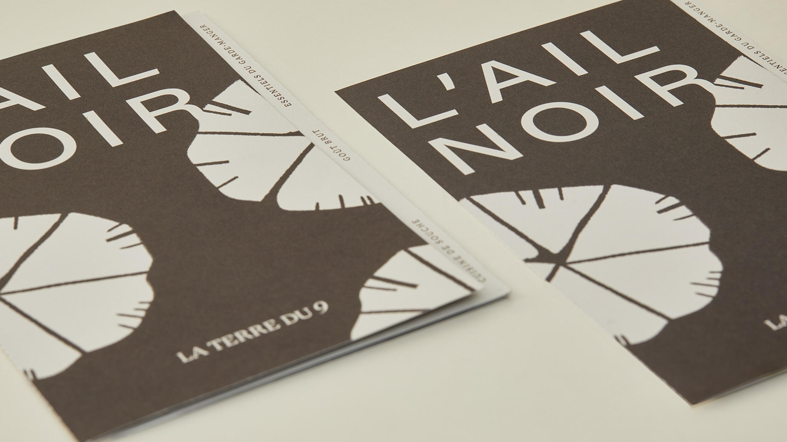
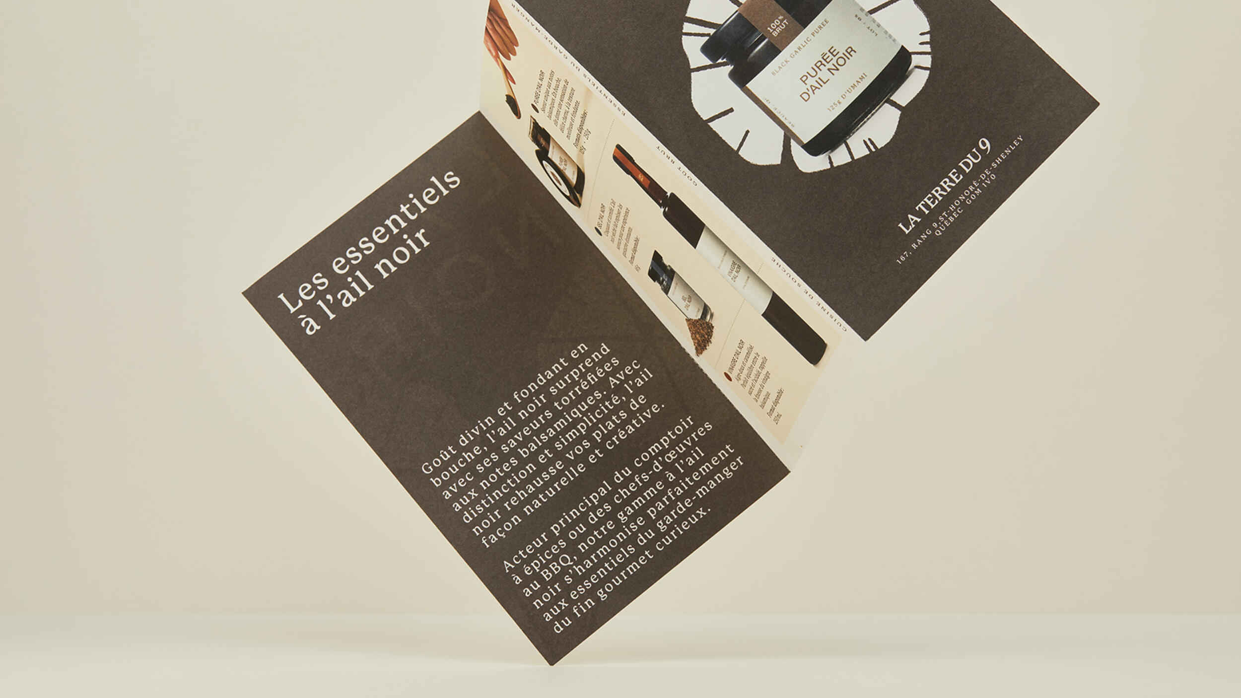
Looking good is not enough: if a product delights the eye but never makes it onto the plate, little has been achieved. Given how unfamiliar some of these flavours may be, guiding the curious with a copy that is clear yet evocative becomes essential — carrying us from purchase to kitchen, clarifying what each product is and does, and lending flavour to the brand along the way.
the challenge
To create a packaging system across multiple formats with rigour and elegance. To develop a coherent graphic language that would make the discovery of black garlic and its lesser-known products accessible. To illustrate the family character of the business and anchor it to its origins.